Mobile Transaction View
Mobile Transaction View
Track the approval process of your request
Track the approval process of your request
One of the new key areas of focus is to streamline and simplify the “employee” experience. Within the context of Mesh, it means the day-to-day users of our platform, the “non-finance” users.
One of the new key areas of focus is to streamline and simplify the “employee” experience. Within the context of Mesh, it means the day-to-day users of our platform, the “non-finance” users.
The Challenge
The Challenge
This component housed a lot of critical data and states for both employees and admins. However, as we added more information, it became increasingly difficult for users to understand and navigate.
This component housed a lot of critical data and states for both employees and admins. However, as we added more information, it became increasingly difficult for users to understand and navigate.
The Oppurtunity
The Oppurtunity
This was a chance to redesign the component, aligning it with our new direction. It also laid the groundwork for a broader redesign of the forms in the future.
This was a chance to redesign the component, aligning it with our new direction. It also laid the groundwork for a broader redesign of the forms in the future.
Research and Requirements
Research and Requirements
Also known as “The nitty gritty”
Redesigns can go in two directions—sometimes, you get to start fresh and rethink everything from the ground up, and other times, you need a more careful, structured approach.
With the transaction view, we had to be thoughtful since it involves a lot of small but important details. We started by listing out the key requirements, making sure all the essential fields were covered for both accounting accuracy and policy compliance. Our main focus was to simplify the process, making it easier for employees to use without feeling overwhelming or complicated.
Requirements
Requirements
We categorized the transaction view into Basics, Additional Details, and Action Required to keep things simple.
This helps employees focus on essential information without unnecessary clutter.
We categorized the transaction view into Basics, Additional Details, and Action Required to keep things simple.
This helps employees focus on essential information without unnecessary clutter.
Additional details
Additional details
Transaction ID
Balance impact (?)
Budget name/Trip name
Card #
Employee name
Tags (?)
History
Transaction ID
Balance impact (?)
Budget name/Trip name
Card #
Employee name
Tags (?)
History
Basics
Basics
Transaction charge name (or Merchant name)
Transaction charge amount (USD and other currency)
Transaction date
Transaction charge name (or Merchant name)
Transaction charge amount (USD and other currency)
Transaction date
Action required
Action required
Memo
Spend category
Receipt view / upload
Memo
Spend category
Receipt view / upload
The Ideas
Ready, set, GO
The ideation process was relatively straightforward, once we got the requirements down -- it was easy to understand that the transaction details need to be sectioned. The question being: how should we do it? Here are some of the options I came up with.
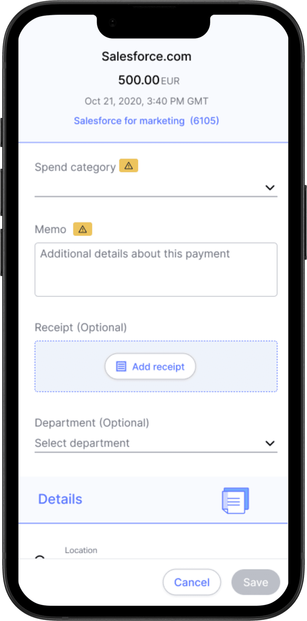
Using Mesh Tag
Using an Alert icon with the Mesh tag ensures consistency—employees see the same alert in the transactions table and the form, making it clear where action is needed.
Cons: Might be too much of an “alert”
Option 1
Using Mesh Tag
Using an Alert icon with the Mesh tag ensures consistency—employees see the same alert in the transactions table and the form, making it clear where action is needed.
Cons: Might be too much of an “alert”
Option 1
Option 2
Using section headers
Section headers help separate required and optional fields.
Cons: The form's order will change based on the transaction and its settings, creating inconsistencies that could make it harder for users to complete fields sequentially.
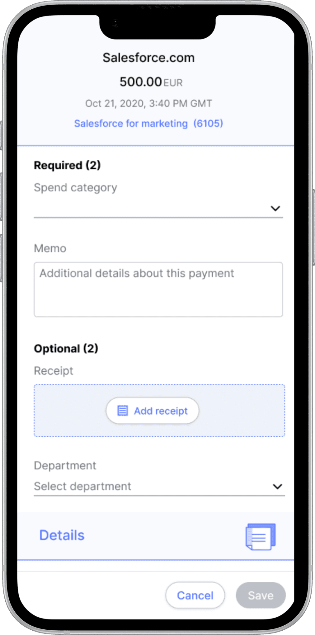
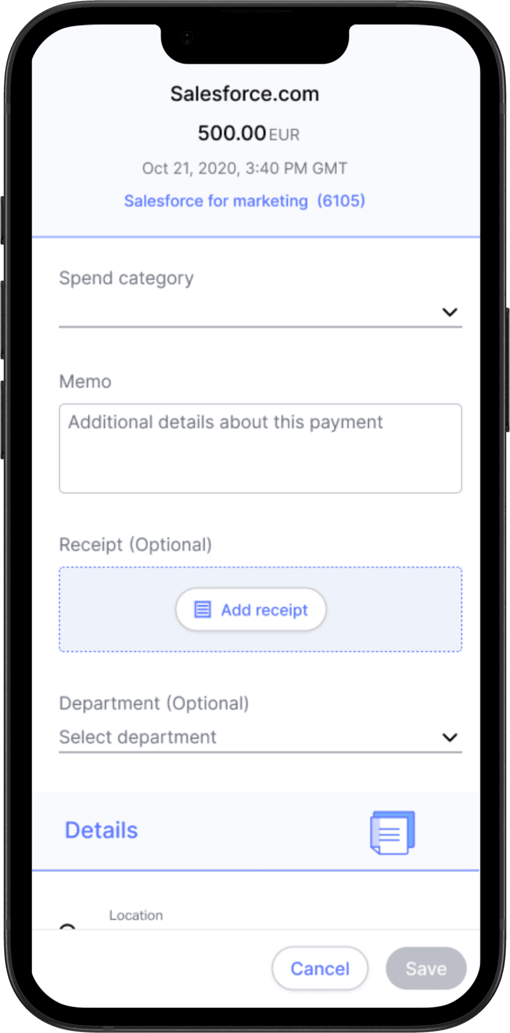
Option 3
Form
The form is the primary focus, while additional details are secondary and accessible by scrolling down.
Cons: Might be too much for the user to differentiate between optional and required
Using Mesh Tag
Using an Alert icon with the Mesh tag ensures consistency—employees see the same alert in the transactions table and the form, making it clear where action is needed.
Cons: Might be too much of an “alert”
Option 1
Option 2
Using section headers
Section headers help separate required and optional fields.
Cons: The form's order will change based on the transaction and its settings, creating inconsistencies that could make it harder for users to complete fields sequentially.
Option 3
Form
The form is the primary focus, while additional details are secondary and accessible by scrolling down.
Cons: Might be too much for the user to differentiate between optional and required
The Solution
The Solution
Drumroll please…
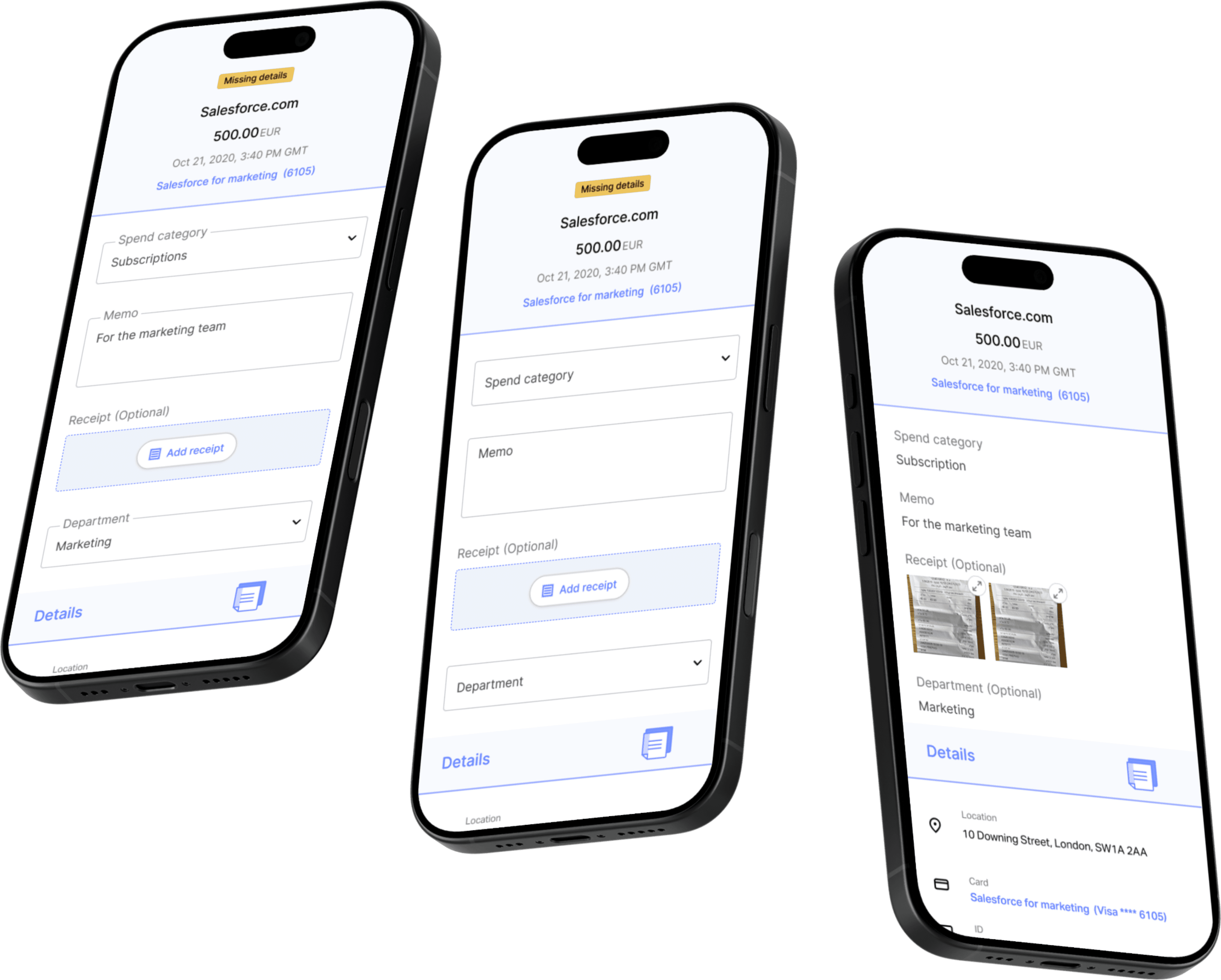
This project was ultimately deprioritized to make room for more urgent milestones, so it was never developed. However, the final solution for the mobile transaction view (see above) was the selected design.
In this solution, the transaction screen is divided into two key sections:
For employees, the view separates:
Actionable items that need attention
Supplemental details that provide context
For admins, the screen follows a similar logic:
The coding section (where action is required) appears first
Information submitted by the employee is shown next in a read-only format
Additional context is presented at the end
At the top of the screen, a persistent banner displays the most critical transaction details—merchant name, amount, date, and the associated virtual card. This banner remains sticky as the user scrolls, minimizing in size to preserve context without sacrificing screen space within the modal.
